Football, Pythagoras and Bad Statistical Communication
I recently picked up the book Mathletics “How gamblers, managers, and fans use mathematics in sports.” by Wayne Winston after hearing a recommendation in an online R meetup.
The first chapter “Baseball’s Pythagorean Theorem” describes a mathematical relationship attributed to Bill James. The idea is to estimate the percentage of games won in baseball based solely on the offensive and defensive production (runs scored, and runs allowed respectively).
$$ \text{% games won} = \frac{\text{runs scored}^2} {\text{runs scored}^2 + \text{runs allowed }^2} $$Bill James studied many years of Major League Baseball standing and found the percentage of games won by a baseball team can be well approximated by the formula
My first thought was this doesn’t look very “pythagorean” at all but I continued. Later, the right hand side of the equation was divided through by $\text{runs scored}^2$ and by letting $R = \frac{\text{runs scored}} {\text{runs allowed}}$ you get the new expression:
$$ \text{% games won} = \frac{R^2} {R^2 + 1} $$Now this really isn’t looking pythagorean!
The chapter continues touting the accuracy of the formula:
For example, the 2016 LA Dodgers scored 725 runs and gave up 638 runs. Their scoring ratio was 1.136, with a predicted win percentage of .5636 and they actually won .5618.
To the authors’ credit, they attempted to replicate Bill James expression using data from the 2005-2016 seasons (and excel’s data table). What they did was generalize the equation above to allow the exponent to vary ie $\text{% games won} = \frac{R^e} {R^e + 1}$. Ultimately excel found that an exponent of 1.8 minimized the error and that was relatively close to the original pythagorean theorem.
To this point, I was not too bothered (except for the use of excel). I was only mildly concerned about the lack of communication of uncertainty in the estimate. But where things started to not sit right with me was in the estimation of e for other sports.
Daryl Morey, currently the GM for the Houston Rockets NBA team, has shown that for the NFL, e = 2.37 gives the most accurate prediction while for the NBA e = 13.91.
While it’s not entirely clear, the estimate of 2.37 appears to have been generated from a single NFL season, 2015. This is where I started to have issues:
In no particular order:
- How uncertain is the estimate of this magic exponent?
- Why is it we’re assuming this particular functional form? Is there something special about the non-linear equation?
- Could you perhaps get better predictions using points for and points against separately?
- How good are predictions based on random chance alone? In the NFL, there are only 16 games (now 17) in a season.
- Rather than the focus being on the correct estimate, perhaps we should instead quantify the reduction in uncertainty based on the prediction?
- Predicting wins based on points scored seems a bit like predicting foot length by shoe size. It’s less a predictor and more intimately tied to the outcome itself.
- Why is the basketball GM opining on football analytics (half kidding)
I set off to investigate some of the above.
library(tidyverse)
library(nflverse)
library(broom)
library(patchwork)
theme_set(theme_light())
Lets start by looking at the shape of this “pythagorean theorem”
tibble(R = seq(0.5, 1.5, 0.1)) %>%
    crossing(tibble(e = c(2, 1.8, 2.37, 13.91),
                    label = c('MLB (2)', 'MLB (1.8)', 'NFL (2.37)', 'NBA (13.91)'))) %>%
    mutate(pred_win = R^e / (R^e + 1)) %>%
    ggplot(aes(R, pred_win, color = label)) +
        geom_line()
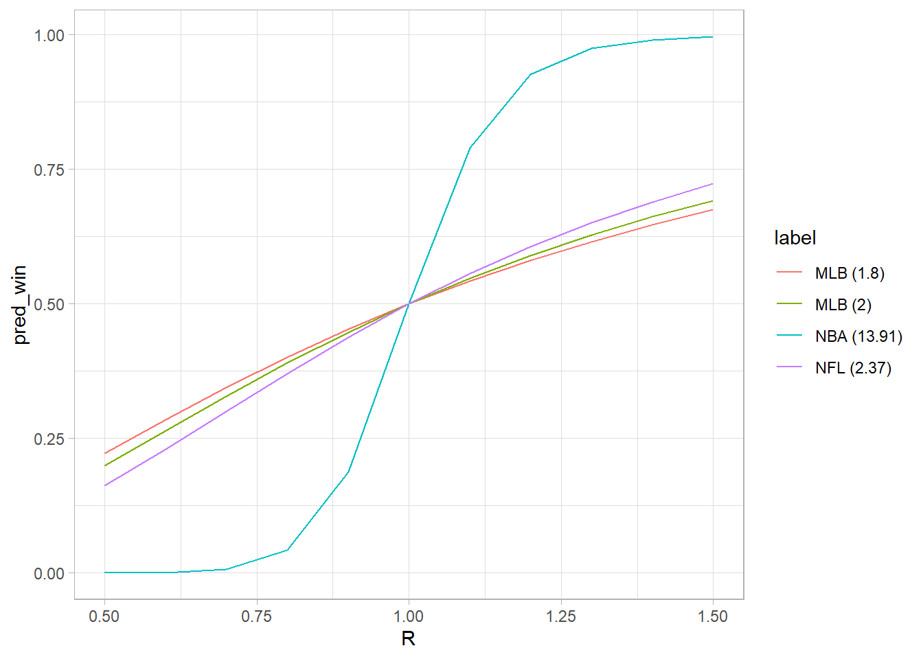 It seems scoring ratio is strongly associated with win probability in the NBA, not so much in the other sports. My guess is this relates to the relative margin of victory in the NBA (and that there are more points scored in general). Also, as the exponent gets larger it looks very sigmoidal (logistic curve).
Now I’ll use NFL data gathered from the load_schedules function from nflreadrr to explore further.
Start by getting wins and losses by team.
## # A tibble: 6 × 11
##   season team      w     l     t total_games win_pct    pf    pa    pd     r
##    <int> <chr> <int> <int> <int>       <int>   <dbl> <int> <int> <int> <dbl>
## 1   1999 ARI       6    10     0          16   0.375   245   382  -137 0.641
## 2   1999 ATL       5    11     0          16   0.312   285   380   -95 0.75
## 3   1999 BAL       8     8     0          16   0.5     324   277    47 1.17
## 4   1999 BUF      11     5     0          16   0.688   320   229    91 1.40
## 5   1999 CAR       8     8     0          16   0.5     421   381    40 1.10
## 6   1999 CHI       6    10     0          16   0.375   272   341   -69 0.798
The results table contains all team results from the 1999 through 2021 seasons
Let’s take a look at the results of the 2015 season
nfl_results %>%
  filter(season == "2015") %>%
  ggplot(aes(r, win_pct)) +
  geom_nfl_logos(aes(team_abbr = team), width = 0.075, alpha = 0.6) +
  scale_y_continuous(labels = scales::percent_format()) +
  labs(x = "Scoring Ratio, R",
       y = "Win Percentage",
       title = "2015 NFL Season")
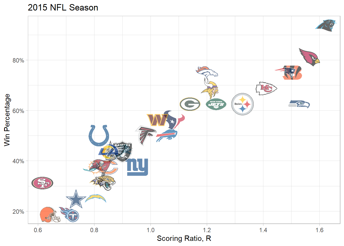 There's certainly a nice upward trend!
Now let’s fit a non-linear model for the 2015 season as described in the book using nls and extract the results using the augment and tidy functions from the broom package.
fit_nls_2015 <- nls(win_pct ~ r^e / (1 + r^e),
               data = nfl_results %>% filter(season == "2015"),
               start = list(e = 2))

# Extract coefficients
nls_coef_2015 <- fit_nls_2015 %>%
  tidy(conf.int = T)

p1 <- nls_coef_2015 %>%
  ggplot(aes(estimate, term, xmin = conf.low, xmax = conf.high, height = 0)) +
  geom_point() +
  geom_vline(xintercept = 2.37, lty = 4) +
  geom_errorbarh() +
  theme(plot.caption = element_text(hjust = 0)) + # set the left align here
  labs(title = "Estimate of exponent ",
       caption = "Dashed line represents Daryl Morey's 2.37 figure")

p2 <- augment(fit_nls_2015) %>%
  mutate(.fitted_low = r^nls_coef_2015$conf.low / (1 + r^nls_coef_2015$conf.low)) %>%
  mutate(.fitted_high = r^nls_coef_2015$conf.high / (1 + r^nls_coef_2015$conf.high)) %>%
  ggplot(aes(r, win_pct)) +
  geom_point() +
  geom_line(aes(r, .fitted)) +
  geom_ribbon(aes(ymin = .fitted_low, ymax = .fitted_high), alpha=0.2) +
  scale_y_continuous(labels = scales::percent_format(), limits = c(0, 1)) +
  theme(plot.caption = element_text(hjust = 0)) + # set the left align here
  labs(x = "Scoring Ratio, R",
       y = "Win Percentage",
       title = "Team Win % vs R",
       caption = "Shaded region represents 95% conf. int.")

patchwork <- p1 | p2

patchwork +
  plot_annotation(
    title = 'Estimating NFL wins using Scoring Ratio R',
    subtitle = "Based on 2015 NFL Season")
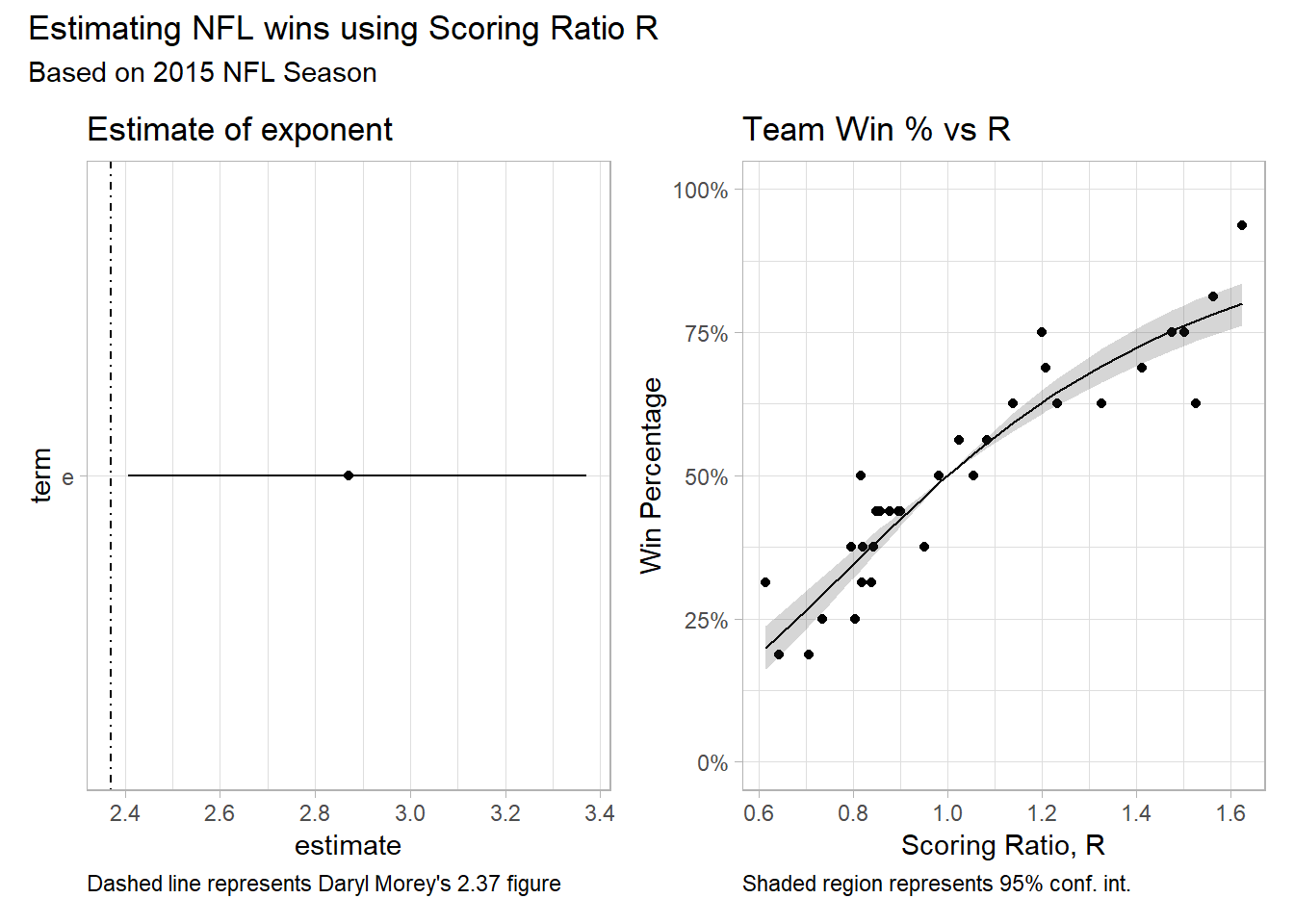
The estimated exponent is 2.87 +/- .235. The Rockets GM estimate of 2.37 falls outside the range. Maybe because he used different data, maybe because he was minimizing MAE and not RMSE? Who knows, but that’s exactly the point.
In upcoming posts I’d like to explore logistic regression, multilevel and bayesian models

Zach Eisenstein
Managing Director
Dynamic Actuary, consultant and manager with 14+ years of diverse insurance experience across property/casualty lines.